Last month I gave a seminar about the Global Soil Survey (GSS). Soil tests generate a lot of numbers. The GSS, as a collection of soil tests from a lot of sites, is a lot of numbers. What is a good way to represent those numbers, in summary, for rapid comprehension?
Showing the numbers as a histogram is one way to do this. Wikipedia describes a histogram as “an accurate graphical representation of the distribution of numerical data.” I remember that when I started graduate school, there were a lot of histograms shown in one of my classes, and at first I wasn’t familiar with them. In my seminar about the GSS, I wanted to make sure everyone understood what the histograms were representing, so I explained why I was showing the data in this way, using golf scores as an example.
Let’s imagine I play golf ten times, and would like to summarize the scores. I could just write down the scores. This is pretty easy to grasp, that the lowest round was 81, the highest was 92, and of these scores it seems most are in the mid-80s.
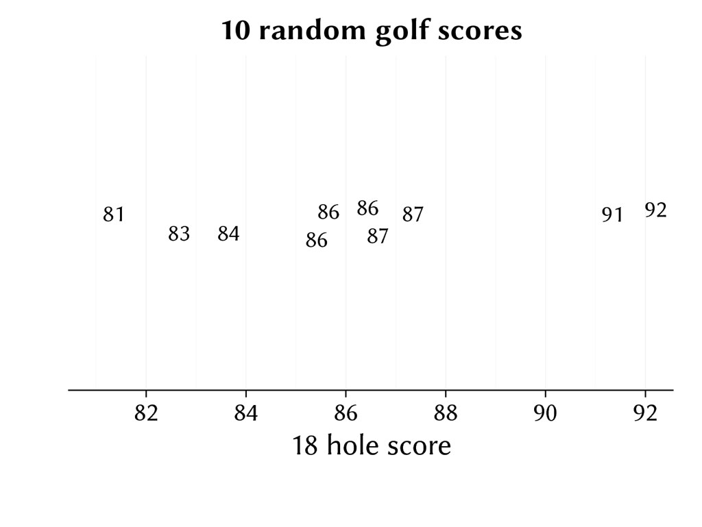
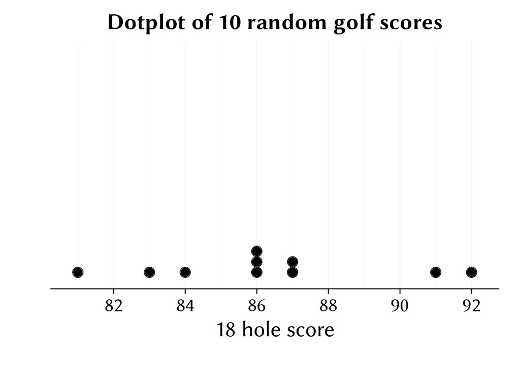
To show those numbers on a chart, I could put a dot for each score. This is a dot plot.
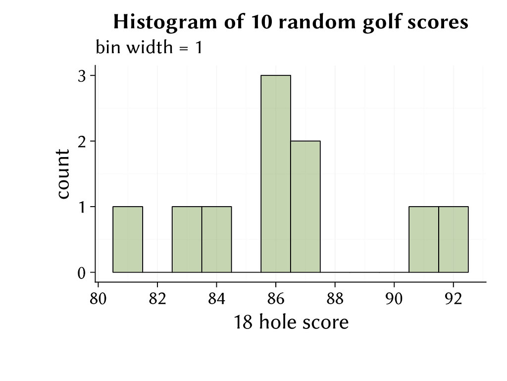
I can also show those numbers as a histogram. The scores are placed into bins, in this case with a bin width of 1, and then the count of the number of scores in each bin are shown. This makes it clear that I shot 81 once, did not shoot 82, shot 86 three times, etc.
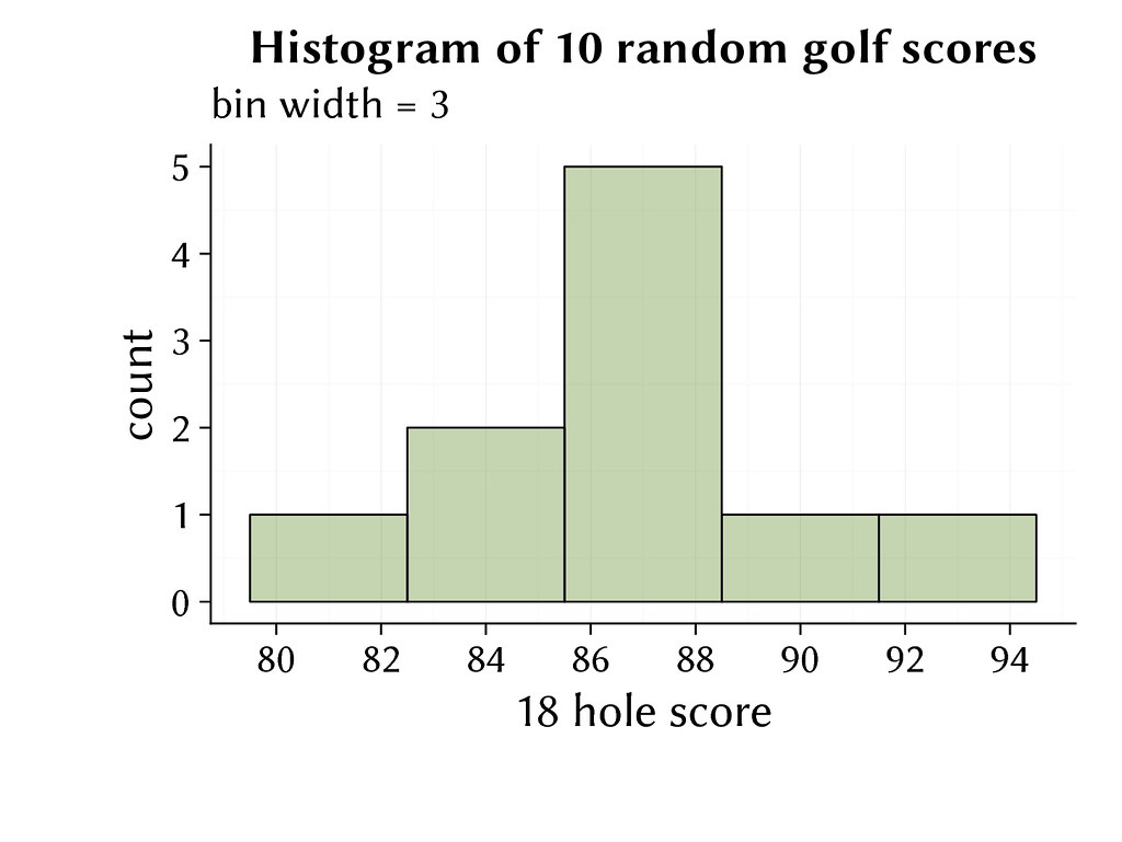
With histograms, the bin width is usually wider than the unit of measure. This gives a clearer summary of the distribution of the numbers. In this case I’ve set the bin width at 3. Now the histogram shows that there was one score in the range from 80 to 82, two scores in the range from 83 to 85, five scores in the range from 86 to 88, and so on.
When there are only ten numbers to look at, all of the charts are easy to comprehend. In fact, just writing down the scores is just as clear to me as the dot plot and the histogram.
But the histogram scales up well when there are a lot of numbers. Writing the numbers down doesn’t. When I have 100 scores, writing all the numbers down doesn’t let me quickly grasp how the numbers are distributed.
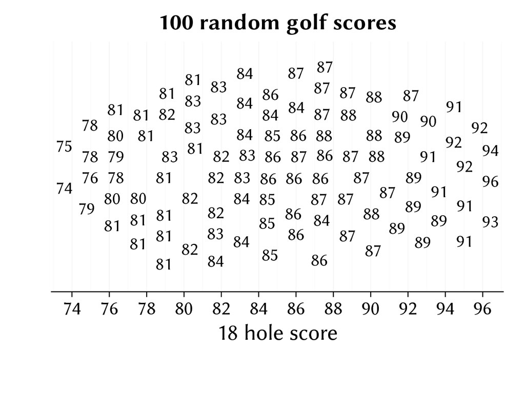
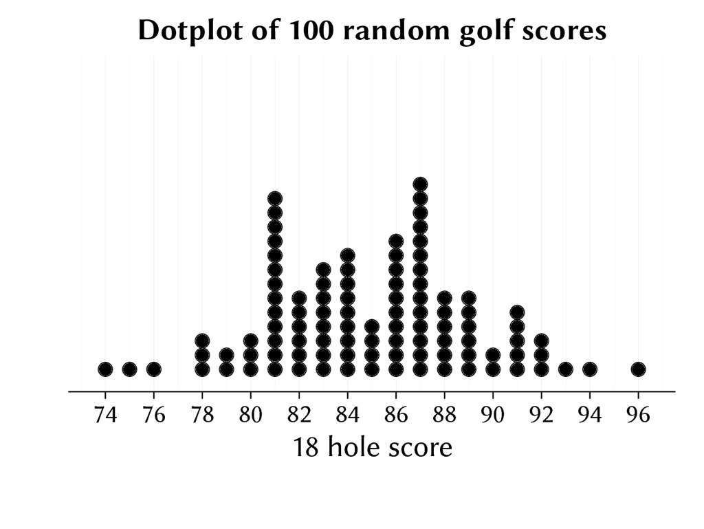
With 100 numbers on a dot plot, I can see the distribution a bit more clearly.
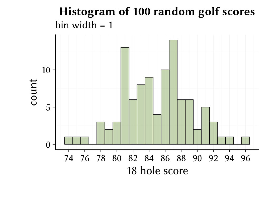
The same 100 scores on a histogram with a bin width of 1 shows the detail of the scores, but that bin width also shows more noise. These are random numbers, so the peak of scores at 81, and at 87, are random, and if I would generate 1,000 or 100,000 random scores, those peaks would disappear.
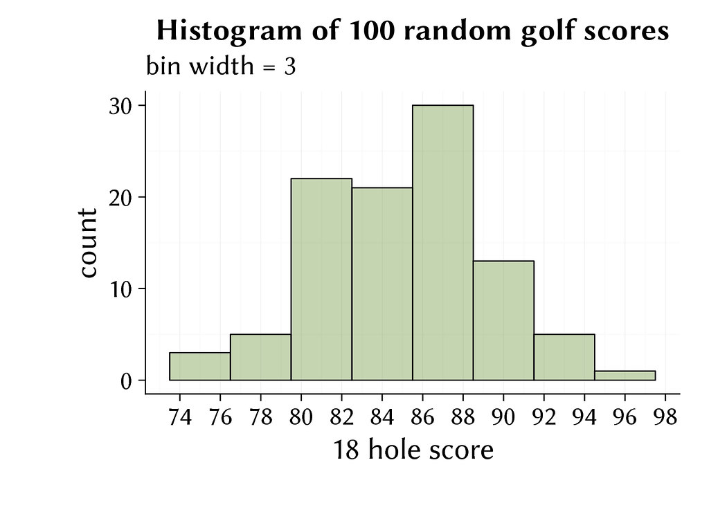
With a bin width of 3, the distribution of the 100 scores is clear. Now there are no more peaks showing random noise. I rarely shoot less than 80, there are a lot of scores in the range from 80 to 88, and the most common score is in the range from 86 to 88.
Because the histogram with an appropriate bin width scales well to the representation of a lot of numbers, I often show soil test data with histograms.
These are the slides for the GSS presentation, going through the histogram explanation first, with random golf scores, and then showing key results from the soils in the Global Soil Survey.